

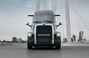

MACK
PIONEER™
The Mack Pioneer ™ project focused on advancing the brand’s next-generation C.M.F. direction, exploring how color, material, and finish could evolve alongside new architectural and design themes. As Lead C.M.F. Designer, I was responsible for developing the core material and color strategy—establishing a foundation that balanced durability, tactility, and a more progressive visual language.
My contributions centered on defining the C.M.F. vision and key material decisions during the development phase, prior to the program’s final production release.
-
C.M.F. strategy development and direction.
-
Material and finish exploration for next-generation applications.
-
Color palette definition aligned with evolving brand identity.
-
Collaboration with design and engineering teams during early development


MACK
ANTHEM™
The Mack Anthem™ became a platform to explore how C.M.F. can communicate strength, precision, and modernity within the heavy-duty space.
As Lead C.M.F. Designer, I developed a material and color strategy that emphasizes contrast, tactility, and visual weight—pairing robust, hard-wearing materials with refined finishes to create a balanced and purposeful environment.
-
Contrast-driven color palette.
-
Expressive material breakups and layering.
-
Soft-touch vs. hard-wearing surface balance.
STELLANTIS
FIAT 500L
In 2014, the Fiat 500L became a platform to explore how badge systems and graphic storytelling can bridge the gap between automotive heritage and iconic lifestyle branding for the 2014 Vans U.S. Open.
As a Badging and Graphics Designer, I helped develop an integrated visual system that captures the "Off the Wall" spirit—translating street-culture graphics and brand identity into a production-ready automotive environment.
-
Multi-tiered brand flag and badging systems.
-
Technical graphic scaling and decal application.
-
Integrated interior textile and motif development.
-
Collaborative design and engineering alignment.


STELLANTIS
STUDIO WORK
In parallel, I supported studio teams on a range of concept vehicles, contributing to graphic development across both production and event-driven programs.
The design language developed for these programs was highly successful, serving as a foundational influence for future performance trims which included elements from the RAM Predator concept carrying through to the 2014 RAM Rebel.
-
Specialized hard-badge development.
-
Cohesive interior and exterior visual branding.
-
Self-initiated CMF + graphics integration.
-
Cross-functional support for production and event-driven design programs.
-
Concept-to-production influence (RAM Predator → RAM Rebel).
-
Studio support: Dodge Viper ACR, Jeep Wrangler Rubicon Hard Rock.


DDH - VIDEO
STUDIO WORK
(Youtube, OTT, Heavy-Up)
Specializing in creating innovative, data-driven video solutions. Using analytics and creative storytelling to produce engaging video content that amplifies brand messages, drives audience engagement, and delivers measurable results.


DDH - PRINT & DIGITAL
STUDIO WORK
For the Volvo campaign, I aimed to create a visual identity that feels unified and approachable, whether you're exploring it online or flipping through a printed brochure. My focus was on developing a clean, elegant look that communicates trust and sophistication without feeling overdone.
I kept the design simple—using a minimal color palette and thoughtful typography—to make sure the message stays clear across all platforms. It was exciting to see how a consistent visual language can bring together digital and print experiences, making the brand feel both premium and relatable.
-
Developed a cohesive visual system.
-
Used a restrained color palette and clear typography.
-
Ensured consistent branding across all media forms.


DDH - PRINT & DIGITAL
STUDIO WORK
For Lincoln, I played a key role in crafting a cohesive visual identity that bridges digital experiences and print collateral. The objective was to evoke Lincoln’s signature blend of sophistication, American craftsmanship, and modern luxury.
I focused on translating strategic messaging into a refined visual language, utilizing simple layouts and a strong typographic hierarchy. This approach ensured that the brand's narrative remained consistent and impactful across all touchpoints—web, mobile, and print—delivering a unified and elevated brand presence.
-
Emphasized elegance through minimal color use and refined typography.
-
Developed a consistent visual system for digital and print media.


DDH - DIGITAL
STUDIO WORK
One of my key roles across many brands I work with is developing their websites and designing digital assets such as ODA and web banners. My focus was on developing a sleek, user-friendly experience that highlights Mazda’s innovative spirit and family-friendly appeal.
I worked to ensure that the design feels fresh and approachable, with a clear hierarchy that guides users effortlessly through the site and promotional content.
-
Designed a modern, intuitive website experience.
-
Built targeted digital ads and banners to engage customers.
-
Ensured consistent branding and messaging across all digital touchpoints.


DDH - PRINT
STUDIO WORK
For Maserati, I crafted a refined visual identity tailored specifically for print collateral. The objective was to evoke the brand’s legacy of Italian craftsmanship, performance, and luxury through a sophisticated and impactful print language.
-
Designed elegant layouts.
-
Developed a cohesive typographic hierarchy and color palette.
-
Designed brochures, service coupons & sales collateral.

DDH - SOCIAL
BMW | OEM
Contributed to creating the social asset library initiative, which focused on elevating dealership-level marketing through a cohesive and premium digital content system. The project explored how motion and static assets could consistently reflect BMW’s brand identity across modern social platforms.
-
Social asset design and production for dealership use.
-
Development of 1:1 and 9:16 digital formats.
-
Motion and static content creation.
-
Brand consistency across all visual outputs.


